
In today’s digital age, the way people access the internet is constantly evolving. With the proliferation of smartphones, tablets, and various other devices, users expect websites to be accessible and functional across all platforms. This is where responsive web design comes into play. According to Google, 61% of users are unlikely to return to a mobile site they had trouble accessing. The importance of responsive is increasing day by day.
What is Responsive Web Design?
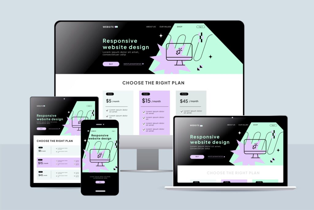
Responsive web design is an approach to web development that ensures a website’s layout and content. Adapt seamlessly to the screen size and orientation of the device being used as a result your website looks great on all devices like mobile, tablet, or desktop. Whether it’s a desktop computer, a smartphone, or a tablet, a responsive website will adjust its design accordingly, and it provides users with an optimal viewing experience.
Why is Responsive Web Design Important?
1. Enhanced User Experience:
A responsive website ensures that users can easily navigate and interact with your site regardless of the device they’re using. This leads to higher engagement, longer time spent on your site, and ultimately, increased conversions. The importance of Responsive Web Design is emerging with time.
2. Improved SEO Performance:
Search engines like Google prioritize mobile-friendly websites in their search results. By implementing responsive design, you can improve your site’s mobile usability, which can positively impact your search engine rankings and drive more organic traffic to your site.
3. Cost and Time Efficiency:
Maintaining a separate mobile version of your website can be time-consuming and costly. With responsive design, you only need to manage one website, and it saves you both time and resources in the long run.
4. Future-Proofing:
As new devices with varying screen sizes and resolutions continue to emerge. Responsive design ensures that your website remains compatible and accessible to all users, both now and in the future.
Statistics of responsive website design:
-
Mobile Internet Usage:
- According to Statista, as of 2023, mobile devices accounted for over 54% of global internet usage, indicating the significance of mobile-friendly website design.
-
Google’s Mobile-First Indexing:
- Google announced that it has shifted to mobile-first indexing, meaning it primarily uses the mobile version of the content for indexing and ranking. This underscores the Importance of Responsive Web Design for SEO purposes.
-
User Expectations:
- Research by Adobe found that 38% of people will stop engaging with a website if the content/layout is unattractive, emphasizing the importance of responsive design in retaining users.
-
Conversion Rates:
- According to Google, 61% of users are unlikely to return to a mobile site they had trouble accessing, which highlights the correlation between responsive design and conversion rates.
Key Principles of Responsive Web Design:
- Flexible Grids: Using relative units like percentages instead of fixed units like pixels allows your website to adapt fluidly to different screen sizes.
- Media Queries: Media queries enable you to apply different styles based on factors such as screen width, height, and orientation, allowing for a truly responsive design.
- Fluid Images: By setting max-width: 100%; on images, you prevent them from exceeding their containing element’s width, ensuring they scale appropriately across devices.
Our Services: Responsive Design Solutions
We specialize in providing top-notch responsive design services tailored to meet your specific needs. We are dedicated to creating visually stunning and highly functional websites that look great on any device. View our portfolio to know more.
Whether you’re looking to revamp your existing website or build a new one from scratch, we’ve got you covered. From custom design solutions to responsive frameworks like Bootstrap and Foundation, we leverage the latest technologies to ensure your website stands out in today’s competitive digital landscape.
Contact us to get a free consultation.
Conclusion:
In summary, responsive web design is no longer just a trend—it’s a necessity in today’s digital landscape. By prioritizing responsiveness and partnering with Developer Foysal, you can provide users with an exceptional browsing experience. Improve your site’s visibility on search engines, and future-proof your online presence.
For more insights on web development trends and strategies, stay tuned for our daily posts. Don’t forget to follow us for regular updates!